When Disney wanted to create a dark figure they would make them seem as dark and evil as possible where Burton would somehow create something dark and evil into something rather colourful, which can be seen in "Corpse Bride" and "The Nightmare Before Christmas". Where as in Disney of they wanted something to seem dark they would pull out all the strings to make it look and feel as dark as possible for the audience. This is a classic style for both Burton and Disney.
Burton did pick up on some useful tips which make it seem as though there are some similarities between Burton and Disney: when creating an animation they would make the character's and set's seem simple but detailed. This makes it easier for the Artist to create all the necessary drawings they need with out making the film looking boring or uninteresting and without making the Artist jobs hell.

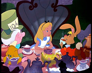
 Burton and Disney must have had the same kind of imagination as both of them wanted to create a classic book "Alice in Wonderland" almost 60 years apart. Even though Tim Burton may not have enjoyed the work he did with Disney, I rather doubt that he didn't appreciate it and he still chooses to co-inside with Walt Disney Productions with some of his films , including one of my favourites, "The Nightmare Before Christmas".

